Wikipedia:Featured picture candidates/Treasury of Athens
Appearance


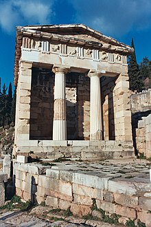
Self-nom. Taken a little while back while in Greece. I think it's as good a photo as you'll see of the most complete building at the site of Delphi. Oh, and the colours are totally natural!
- Nominate and support. Clearly. Smoddy (t) (e) (g) 18:28, 11 Mar 2005 (UTC)
- Support -- I've never been to Greece, but this image took me part way there. - Longhair | Talk 21:47, 11 Mar 2005 (UTC)
- Comment: My support is for the original image. The others don't appear natural. -- Longhair | Talk 12:23, 21 Mar 2005 (UTC)
- Oppose It's a nice picture, but it's not particularly interesting or striking. Junes 22:04, 11 Mar 2005 (UTC)
OpposeIf nothing else, really bad geometry. This needs Photoshop help big time. Denni☯ 00:41, 2005 Mar 12 (UTC)- Oppose Nice but not great. Foreground rocks are in focus while building and columns are slightly out of focus, when the reverse should be true. As already noted, the skewed shot angle is not pleasing to the eye.--Deglr6328 02:31, 12 Mar 2005 (UTC)
- Can I ask what each of you means here? By my reckoning, the treasury itself is equally in focus (this certainly ought to be the case, given my depth of field on my camera). I would agree that the view is perhaps unorthodox, but it is my opinion that the picture is enhanced by this. To me, it fulfills "striking". Smoddy (t) (e) (g) 13:08, 12 Mar 2005 (UTC)
- Don't take it personally, there's no accounting for taste. For me, if either the focus were better or the perspective were fixed I could see supporting. But not both issues as they are now. If a suitably large image were uploaded there might be a chance to fix the blurryness. Like I said this is a nice picture, it's just that I'm very nitpicking with pictures that are to be featured.--Deglr6328 18:16, 12 Mar 2005 (UTC)
- Can I ask what each of you means here? By my reckoning, the treasury itself is equally in focus (this certainly ought to be the case, given my depth of field on my camera). I would agree that the view is perhaps unorthodox, but it is my opinion that the picture is enhanced by this. To me, it fulfills "striking". Smoddy (t) (e) (g) 13:08, 12 Mar 2005 (UTC)
- Support -- As Longhair, I too have never been to mainland Greece but this picture gives me a feel of the kind of things one might see there. I find the picture aesthetically pleasing and striking too. I feel that the comments about focus and the odd camera angle are simply nitpicking: photography is not a science, it's an art! There are pictures with technical problems much worse than this that have been made featured pictures. Dan 14:53, Mar 12, 2005 (UTC)
- Support original, what's so wrong with perspective!? ed g2s • talk 11:33, 13 Mar 2005 (UTC)
- oppose skewed, fails to follow rule of thirds or have any symmetry. boring. Dunc|☺ 18:14, 13 Mar 2005 (UTC)
- I support the well-taken first image; the second and third seem off-center to me. --DanielNuyu 05:09, 14 Mar 2005 (UTC)
- Support original. —Korath (Talk) 12:50, Mar 14, 2005 (UTC)
- Neutral I like the subject and the perspective correction in version 3 is a good idea, but now it seems to tightly cropped on the left hand side. Also, is the whole image a little blue? Several of the restored portions, in particular the triglyphs look oddly blue tinged. -- Solipsist 08:09, 18 Mar 2005 (UTC)
- Support original, the others look unnatural to me. Circeus 15:28, Mar 19, 2005 (UTC)
